Theme Customization Guide
Transform your website's chat interface with ChatNexus's comprehensive theming system. Our flexible customization options ensure your chatbot seamlessly integrates with your brand identity while maintaining optimal user experience.

Quick Start
Want to get up and running fast? Here's what most users do:
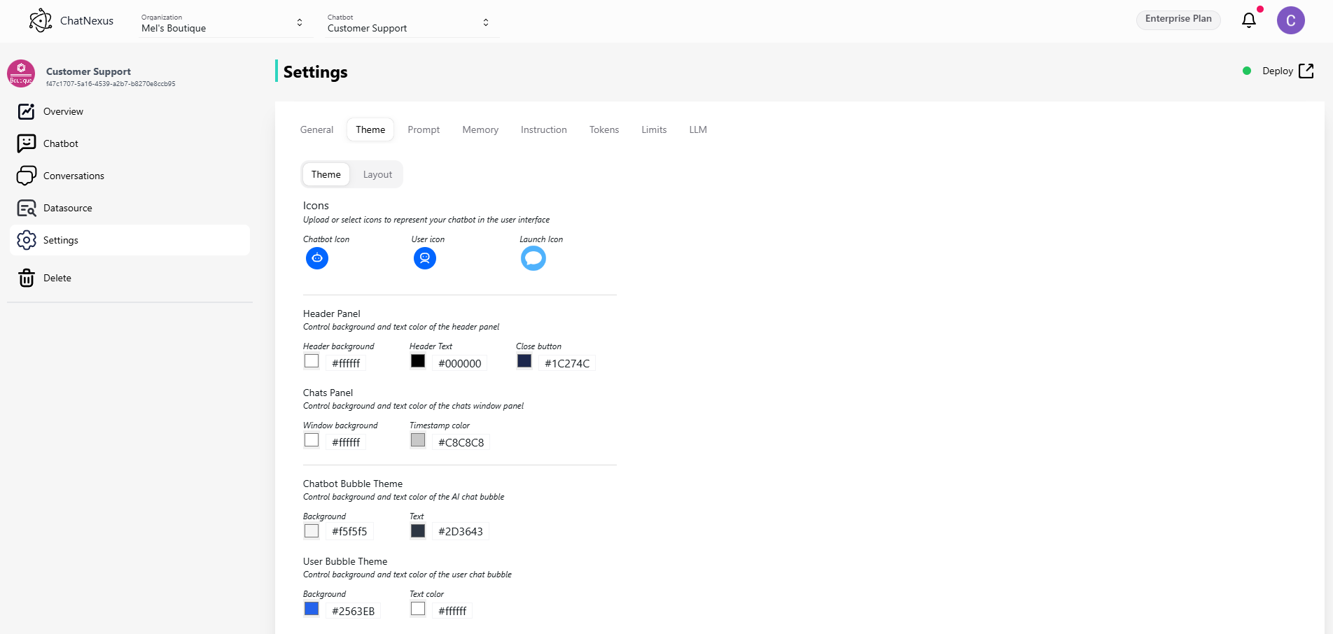
- Set your brand colors in the Header Panel section
- Upload your logo as the Chatbot Icon
- Position the chat window (most sites use right alignment)
- Save and test on your site
Layout Options
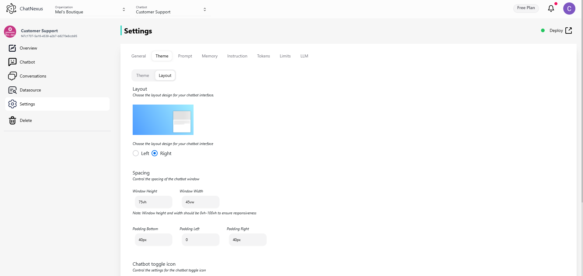
Positioning Your Chat
Think about where your users will expect to find the chat:
- Right side (recommended): Works well for most western languages
- Left side: Good for right-to-left languages or when your main CTA is on the right
Pro tip: Check your website's heatmap - avoid placing the chat where it might cover important content.
Sizing Guidelines
Make your chat window the right size for your content:
- Too big: Overwhelms your website
- Too small: Makes conversations feel cramped
- Just right: Users can see 4-5 messages at once
💡 Quick Fix: Start with the default size (75% height, 45% width) and adjust based on your content.
Making It Look Good

Choosing Icons
Your icons set the tone for the conversation:
- Chatbot Icon: This is your bot's face - use your logo or a friendly avatar
- User Icon: Keep it simple and generic
- Launch Icon: Make it obvious it's for chat (speech bubble icons work well)
Color Schemes That Work
Match your brand without sacrificing usability:
For the Header:
- Use your primary brand color for the background
- Ensure text strongly contrasts with the background
- Keep the close button visible but not distracting
For Messages:
- Bot messages: Light, neutral colors work best
- User messages: Your brand's primary or secondary color
- Background: Stick with white or very light gray
👉 Tip: Test your color scheme with dark mode if your site supports it.
Common Questions & Solutions
"My chat window covers important content"
- Try reducing the window width
- Add padding to push it away from the edge
- Consider a smaller toggle button
"Users can't find the chat"
- Make the toggle button larger
- Use a more prominent color
- Add an animation to draw attention
- Consider adding a welcome message
"Text is hard to read"
- Increase contrast between text and background
- Try a larger font size
- Add more padding inside message bubbles
"It doesn't look good on mobile"
- Reduce button size on small screens
- Use full width for the chat window
- Increase touch targets for better interaction
Testing Your Design
Before going live:
- View on different screen sizes
- Test with your actual content
- Try dark/light modes if applicable
- Check all interactions (open, close, scroll)
- Get feedback from team members
Design Tips by Industry
E-commerce
- Use product colors in the chat theme
- Make the toggle button highly visible
- Include your logo for brand recognition
B2B Services
- Keep it professional with subtle colors
- Use slightly larger text for detailed conversations
- Position where it won't interfere with lead forms
Healthcare
- Use calming colors (blues, greens)
- Make text very readable
- Ensure high contrast for accessibility
Tech Companies
- Modern, minimal design
- Dark mode support
- Subtle animations for interactions
Quick Improvements
If you have 5 minutes:
- Update the chatbot icon to your logo
- Match header color to your brand
- Adjust window size for your content
If you have 15 minutes:
- Fine-tune all colors
- Test on mobile devices
- Add custom icons
If you have 30 minutes:
- Get team feedback
- Test with real conversations
- Optimize for all screen sizes
Note:
Remember: The best chat interface is one that your users barely notice because it works so naturally with your site. Need more help? Contact our support team or check out our showcase of successful implementations.