Theme & Layout Settings
This guide covers the Theme and Layout settings for customizing your ChatNexus chatbot.
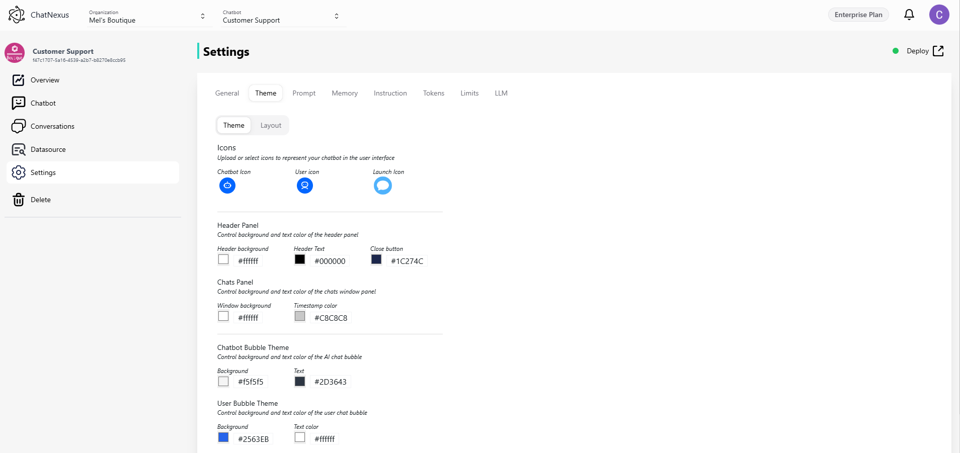
Theme Settings
Visual Elements
- Icons: Customize chatbot, user, and launch icons to match your branding.
- Color Scheme:
- Configure colors for the header, including background, text, and close button.
- Adjust the chat panel background and timestamp text colors.
- Set colors for message bubbles (both bot and user), including background and text colors.
- Font Size: Choose from various text size options for better readability.
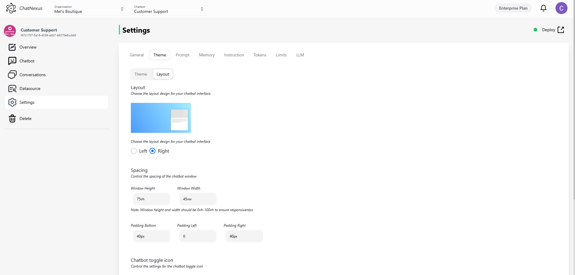
Layout Settings
- Window Position: Align the chatbot window to the left or right side of the screen.
- Window Dimensions: Define the chatbot’s height and width within a range of 0-100h and 0-100w, making it responsive to different screen sizes.
- Padding Controls: Fine-tune spacing for bottom, left, and right margins to maintain optimal placement.
- Chat Toggle Icon:
- Customize the icon size for better visibility.
- Adjust padding for precise bottom and right positioning.
- Chat Bubble:
- Enable or disable the chat toggle icon in the bottom right corner of the page.
Click Save to apply changes.